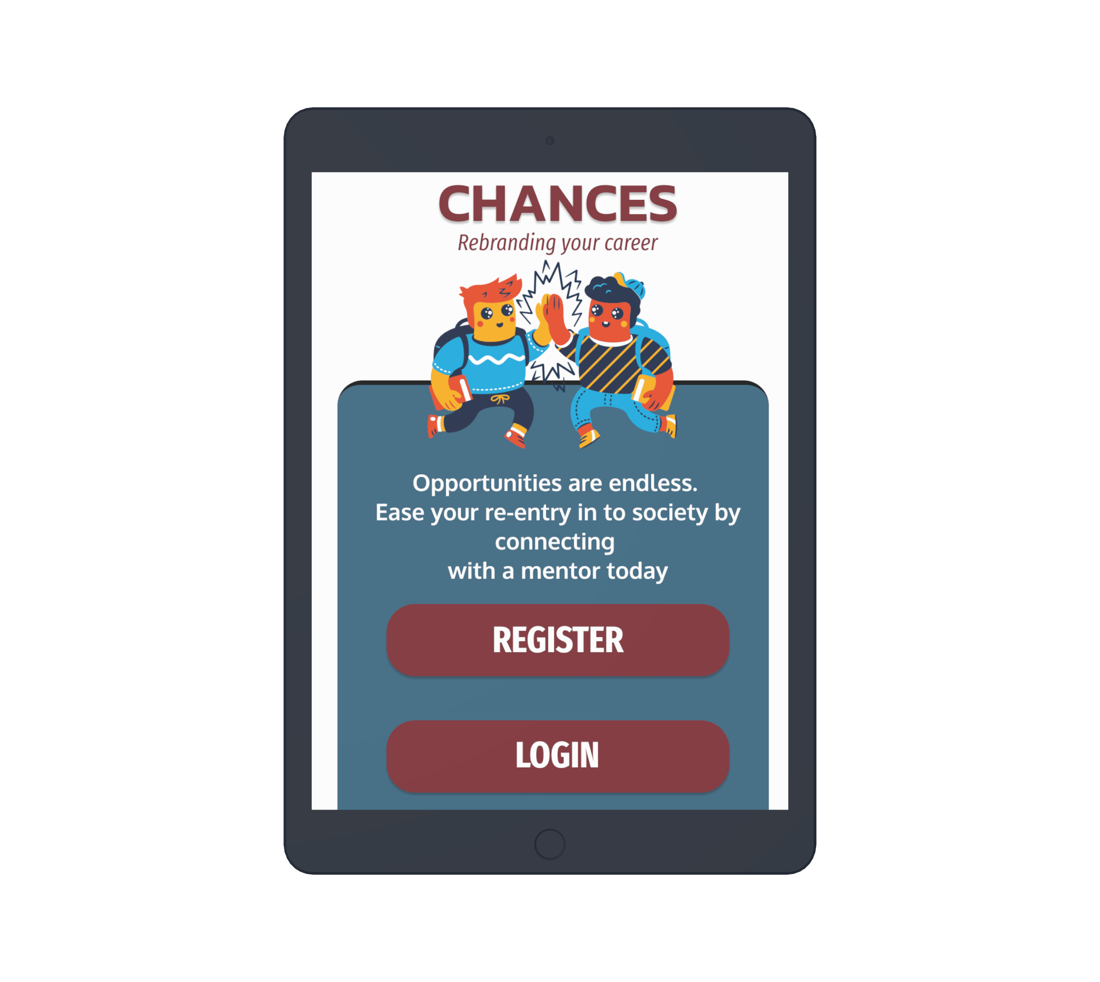
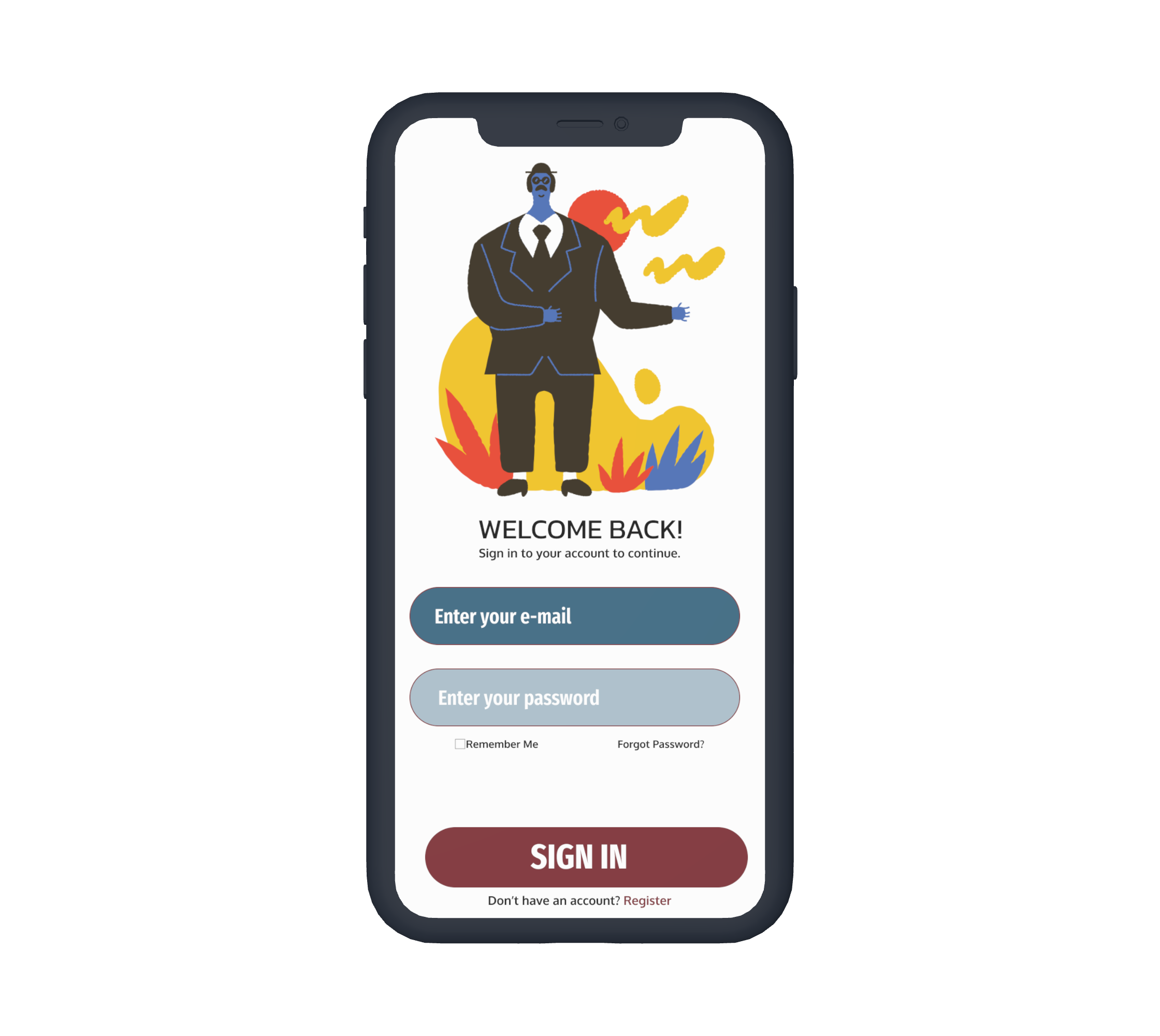
CHANCES is a mobile app designed to provide mentorship services to those who were formerly incarcerated.
My Role:
UX Researcher, UX Designer, UI Designer, UX Writer, and Information Architect
Duration:
June 2022-August 2022
People who are formerly incarcerated have a hard time entering or re-entering the workforce, because of preconceived notions of who they are. The world is also changing quickly each day and they do not receive the proper resources & education while serving time to enter the workforce the moment they enter society.
I wanted to create an app that took away a barrier to entry and to provide a space that felt safe to them amongst people they could trust to guide them on their career path.
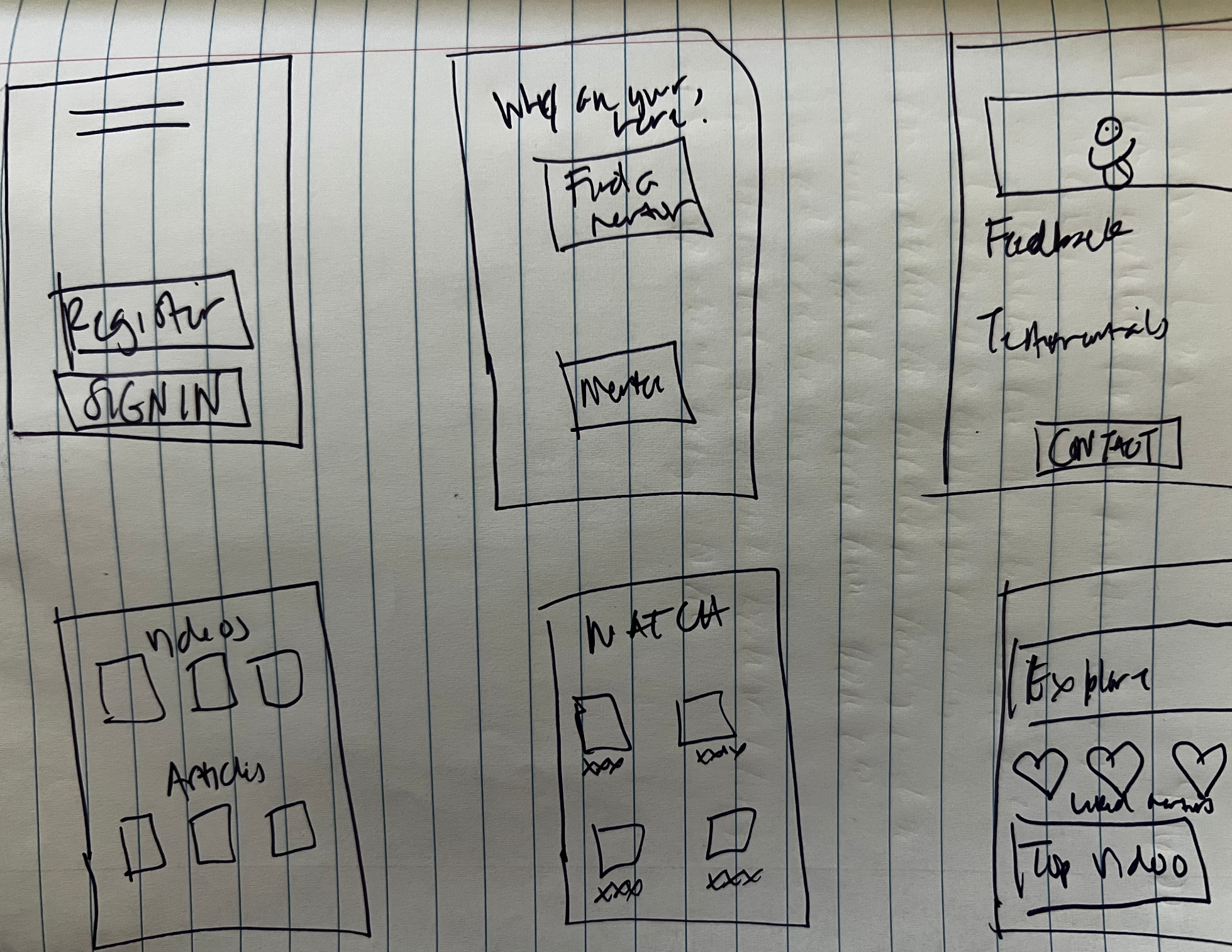
My responsibilities throughout the project were building paper & digital wireframes, creating low and high-fidelity prototypes, as well as conducting research before, during, and after designing
One of the biggest assumptions that I made going in to this research is that technology would be too daunting for those who were formerly incarcerated since they do not have a lot of access to technology when they are serving their time. What I learned throughout the research I conducted was that they are open and eager to learn, even though they did not have a lot of experience with technology. They also fear being judged by the outside world and not being given a second chance to prove that they are capable and willing to succeed at the work they do. This information gave me some good insights to build an app that was easy to follow, as well as putting education & mentors that fit their needs front and center.
Antoine is a father of three who needs to be able to find mentors who he can relate to because he will wants to feel safe in searching for a new job and not feel judged
Rainey is a young woman who was wrongly convicted who wants to find a mentor that can help her find a job to support herself because she wants her life back after serving a sentence for something she did not do
After conducting a competitive audit, I realized there is major room for Chances to exist and grow quickly as there isn’t currently a countrywide mentorship app catered to formerly incarcerated individuals
In order to address the gaps and opportunities from my competitive audit, I performed an ideation to showcase where Chances can enter the market with a competitive advantage. I focused on connection through similarities amongst the participants in the program
On the user’s dashboard, I focused on tailoring it to the user’s specific needs & goals which is pulled from their answers to the career questions. Research participants mentioned wanting some recommendations for mentors to help them in making their final decision
The career mentors will automate based on the user’s career goals. The mentors shown here will align with their career goals
Under the career mentor are video resources that give the user interview tips from someone previously in their shoes. This can create user trust & safety
User enters the app by creating an account or signing in. When they are creating an account, they can select their career goals so mentors are tailored to them. After they have created their account, they land on their dashboard where they can find mentors tailored to them
In order to test the low-fidelity prototype, I set up a remote moderated usability study with 7 participants in Denver, Colorado which took approximately 45 minutes. Based on the research conducted, I was able to determine the following:
Testing the low-fidelity prototype
Users need more explanation with each button. They do not have the working knowledge of icons without descriptors
Users want to be able to access other videos related to career tips quickly
Users want to know others experience with the mentors
Prior to the usability study, my plan was to only include icons for the bottom navigation. After some breakdowns in the user flows during the usability study, I added descriptors to help the users navigate with more ease
Prior to the usability study, my plan was to only include a “heart” icon so the user can save the mentee. After some breakdowns in the user flows during the usability study, I added descriptor underneath the heart button to give the user more direction on where to “favorite” the mentee
When designing, I always want to take in to consideration the accessibility of my designs. Below are accessibility factors I thought of while designing
Considered visually impaired by utilizing colors that would be easy to read and including text for screen readers
Used images that are universal that would help all users understand designs
Used icons for screen readers and to help navigation easier
Building a sitemap for a responsive design
After completing the app designs, I created a sitemap to show the layout of a responsive website. With the increase in screen size, I was able to add more menus to the page. I used this sitemap to ensure designs were cohesive and consistent across each screen
The designs on each screen were optimized for a great user experience based on the screen size the user was accessing the app.
MOBILE
TABLET
DESKTOP
Moving forward…..
Users shared that the mentorship app is very beneficial to them being able to re-enter society with ease and confidence. One of the users mentioned that they have been searching for something similar so they can get some guidance on finding a job, because it has been difficult for them. I learned that it in order to create the best designs with the greatest impact, it is very important to conduct research at every stage. Make sure your research is diverse and relevant to the people you are targeting. To improve on the design, I would want to:
Conduct another usability study to iterate on designs and ensure designs address user pain points
Conduct additional user research to determine other needs
Increase accessibility by determining parameters for adding additional languages


